Foundations
What is usability
Contextual usability
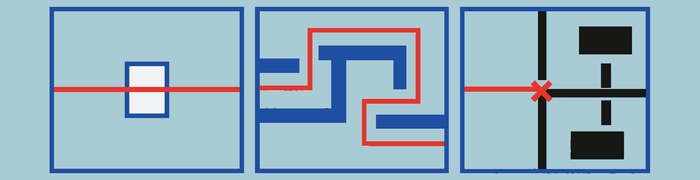
Usability is the degree to which particular people can achieve particular goals effectively, efficiently, and satisfactorily in a particular context. It is not synonymous with visual simplicity, familiarity, accessibility, delight, or ease of first use, although all can contribute to it.
A product can be easy to learn but inefficient for experts. It can be efficient in a quiet office but unusable while walking. It can be accessible to a screen reader yet conceptually confusing. Usability always depends on the user, goal, environment, device, frequency of use, and consequences of error.
These dimensions should become observable outcomes. Effectiveness asks whether people complete the intended task accurately and completely. Efficiency asks what time, attention, movement, or other effort completion requires. Satisfaction asks whether the experience feels acceptable and trustworthy in use. Success might mean that a first-time customer can correct a delivery address without assistance, while success in a professional tool might mean that an expert can repeat the operation quickly without losing precision.
A usability claim therefore needs a subject and a situation. “This form is usable” is weaker than “people submitting it on a phone can understand the requested information, recover from an invalid entry, and finish without re-entering preserved data.” The same design can succeed in one context and fail in another, so evaluation should reproduce the conditions that materially shape the task.
The interaction loop

Most interactions can be understood as a loop:
Goal → discover an action → predict its consequence → act → perceive feedback → interpret the new state → continue or recover
A usable interface helps answer:
- What can I do?
- How do I do it?
- What will happen?
- What is happening now?
- What happened?
- How do I continue or recover?
- How does this fit into the larger system?
The gulf of execution is the gap between wanting an outcome and discovering how to produce it. The gulf of evaluation is the gap between seeing the system’s response and understanding what it means.
A hidden sharing action widens the gulf of execution. A sharing action that provides no indication of whether it succeeded widens the gulf of evaluation.
Consider moving a document into a shared folder. The interface must expose the move action, identify the destination and audience, preview what will change, accept the commitment, show that work is in progress, and reveal the resulting location and sharing state. If the action is hidden, the loop fails before execution. If the document moves but its new audience remains unclear, the loop fails during evaluation. A useful diagnosis identifies the broken stage rather than labeling the whole experience “confusing.”
The loop also applies when completion is delayed or initiated by the system. A background upload may continue after the user leaves, but the product still needs to acknowledge the request, expose pending state, report completion or failure, and provide a way back to the affected object. Recovery is part of the loop, not an exceptional path outside it.
Heuristics, laws, patterns, and anti-patterns

- A law or empirical effect describes an observed relationship or behavioral tendency, such as Fitts’s Law or the serial-position effect.
- A model explains part of human or system behavior, such as cognitive load, mental models, or information foraging.
- A heuristic is a broad evaluation principle, such as visibility of system status.
- A pattern is a recurring solution to a recurring problem, such as progressive disclosure.
- An anti-pattern is a recurring approach that appears reasonable but predictably causes trouble.
- A deceptive pattern, traditionally called a dark pattern, impairs informed choice or autonomy, typically to benefit the product or business.
These categories overlap. The purpose of classifying them is to understand the strength and scope of a claim, not to establish rigid boundaries.
Takeaways
- Evaluate usability against real users, goals, and contexts.
- Diagnose where the interaction loop breaks.
- Treat named principles as prompts for investigation.
- Measure successful outcomes, not merely preference or visual cleanliness.
- Distinguish accidental usability failures from deliberate manipulation.
Further reading
- ISO 9241-11: Usability definitions and concepts
- Jakob Nielsen’s 10 usability heuristics
- The Design of Everyday Things
How people understand interfaces
Mental models
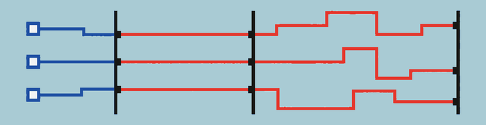
A mental model is the user’s internal explanation of how a product works. It does not need to match the implementation. It needs to help the user predict outcomes.
A user may think of photos as residing “in an album,” even if the system stores references rather than copies. That model is useful until removing a photo from an album unexpectedly deletes the original. At that point, the product has violated the model it appeared to establish.
Mental models answer questions such as:
- Where is my information?
- Is this change local, shared, or global?
- Is it saved automatically?
- Does removing something from a collection delete it?
- Is this screen a destination, a temporary mode, or a modal task?
- Who will see this?
- What will Back do?
The conceptual model is the coherent explanation the product attempts to communicate. The system image is the part users can observe: labels, controls, structure, animation, documentation, and behavior.
Confusion appears when these signals disagree. A toggle suggests an immediate persistent setting, but a separate Save button suggests deferred commitment. A tab suggests a stable destination, but one tab unexpectedly opens a menu.
Affordances and signifiers

An affordance is a possible relationship between a person and an object or environment. A surface may afford pressing, dragging, or scrolling.
A signifier is a perceivable cue that communicates what can be done. Labels, button shapes, handles, underlines, chevrons, shadows, cursor changes, and motion can all signify interaction.
Digital design often uses affordance when signifier is more precise. A card may technically be tappable, but if nothing signifies that possibility, the action remains undiscoverable.
A mismatch of affordance occurs when appearance suggests one action but behavior produces another:
- A tab opens a menu instead of a destination.
- A close icon launches an offer.
- A text link behaves like a toggle.
- A drag handle is not draggable.
- A switch navigates to another screen.
Discoverability

Discoverability is the degree to which available actions can be found.
- Primary actions should normally be visible.
- Common secondary actions should be easy to reveal.
- Rare expert actions may be progressively disclosed.
- Dangerous actions should be discoverable without being easy to trigger accidentally.
- Hidden gestures should accelerate visible functionality rather than provide its only route.
Icons are not automatically universal. A few symbols are widely learned, but most are ambiguous outside a specific context. Labels are especially valuable for navigation, unfamiliar actions, costly actions, and controls whose meaning changes by mode.
Jakob’s Law
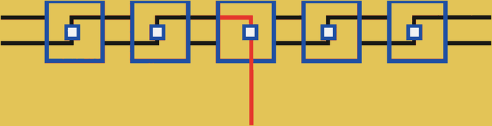
Jakob’s Law observes that people spend most of their time using other products. They arrive with expectations learned elsewhere.
Familiar conventions reduce the amount of new behavior users must learn. Convention does not forbid innovation. It places the burden of proof on deviations. Innovation is usually most valuable in the product’s distinctive work, not in forcing people to relearn ordinary navigation and controls.
These expectations transfer at several levels: a logo commonly returns home, an underlined phrase behaves like a link, Back restores the previous place, and familiar controls retain familiar commitment semantics. A novel navigation pattern can still succeed, but it spends attention before the user reaches the product’s distinctive value.
Depart when the familiar pattern cannot express the task well enough or when a new approach produces a meaningful, testable benefit. Make the new behavior legible through structure, labels, demonstration, and safe exploration. Evaluate whether people can predict it after limited exposure and whether the advantage survives the learning cost. Familiarity is evidence about expectations, not proof that the prevailing convention is good.
Mapping, constraints, and feedforward
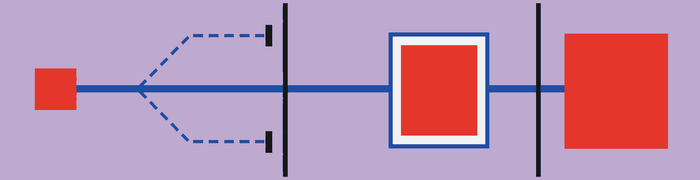
Mapping is the relationship between a control and its effect. Clear mappings place controls near the object they affect, connect movement with a predictable result, and preserve spatial direction.
Constraints reduce possible actions or states:
- Physical constraints: an object cannot move beyond a boundary.
- Logical constraints: an end date cannot precede a start date.
- Semantic constraints: a quantity cannot be negative in its domain.
- Cultural constraints: established conventions shape expectations.
A constraint prevents errors only if the user can understand it. A disabled date with no explanation replaces one error with confusion.
Feedforward communicates consequences before an action: “Delete 14 photos,” a crop preview, the destination of a move, or a label that states the scope of a change. Feedback explains what happened. Feedforward explains what will happen.
The three concepts work together. In a calendar, dragging the end of an event maps movement to duration, the calendar boundary prevents an impossible date, and a live preview shows the resulting time before release. The interaction is easier to predict because the control-effect relationship, valid range, and likely outcome agree.
When diagnosing an action, ask whether the control is associated with the correct object, whether its direction and scale match the result, which invalid states should be impossible, and what the person can know before committing. Constraints should preserve legitimate alternatives rather than simply blocking unfamiliar input. Mappings may also depend on writing direction, platform convention, physical arrangement, or domain practice, so an apparently “natural” mapping still needs contextual evaluation.
Feedforward should be specific enough to support a decision without pretending certainty the system does not have. A destructive action can name the object, scope, reversibility, and affected collaborators. When the outcome depends on permissions, connectivity, or another person, the interface should expose that uncertainty before commitment and then use feedback to report what actually occurred.
Takeaways
- Make the system predictable, not merely visually tidy.
- Keep terminology, structure, motion, and behavior aligned.
- Provide strong signifiers for important actions.
- Use established conventions unless deviation creates meaningful benefit.
- Label scope and consequences before commitment.
Further reading
Perception, grouping, and visual organization
People do not consciously inspect every element and then calculate the structure of a screen. Perception rapidly forms groups, foregrounds, paths, and objects. Visual design communicates relationships before content is fully read.
The picture-superiority effect
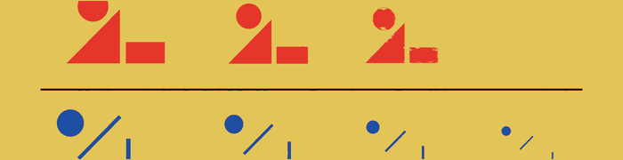
The picture-superiority effect describes the tendency for meaningful, recognizable pictures to be remembered better than equivalent words in many memory tasks. Images can provide concrete visual and semantic cues, and demonstrations can sometimes communicate spatial or physical relationships more directly than prose.
This does not mean that pictures are always processed faster, that every idea should become an icon, or that icons should replace labels. Images can be ambiguous, culturally specific, visually dense, or inaccessible. The widely repeated claim that images are processed “60,000 times faster” than text should not be treated as established evidence.
Use pictures when they add recognition, comparison, spatial understanding, or memory. Use text when precision, naming, searchability, or accessibility matters. Often the strongest treatment combines both.
Shape recognition and icon design

Recognition-by-components, sometimes called geon theory, proposes that people recognize many objects through arrangements of simpler component shapes. It can inspire clear silhouettes and reduced visual complexity, but it is one theory of object recognition rather than a universal icon-design law.
When applying the idea, preserve the features that distinguish the object instead of reducing every symbol to generic primitives. Check the silhouette at its actual size, compare it with neighboring icons, and follow platform conventions where people have already learned a meaning. An icon may be geometrically simple and still be ambiguous if several actions share the same outline. Labels remain useful when the symbol’s meaning is unfamiliar or consequential.
There is no general rule that two-dimensional representations are always recognized faster than three-dimensional ones.
Law of Proximity

Elements near one another tend to be perceived as related. Spacing is semantic because it tells people which labels, controls, and values form a unit before they read every word.
A label should sit closer to its own field than to the preceding field. Space within a section should be smaller than space between sections. Apply the same logic to button groups, metadata, and repeated rows. When every gap is equal, structure becomes hard to scan. When related items are too far apart, they may read as separate tasks. Check responsive layouts so wrapping or stacking does not break the intended grouping.
Law of Similarity

Elements sharing color, shape, typography, scale, position, motion, or treatment tend to be perceived as related. Similarity can communicate that items have the same role, belong to the same category, or share a state.
Controls that look alike should generally behave alike. Different behaviors should receive sufficiently different treatments. Reusing one style for unrelated actions weakens that signal, while styling equivalent actions differently makes the interface harder to predict. Use similarity deliberately, and do not let decorative variation obscure a relationship the user needs to understand.
Law of Common Region

Elements inside a shared boundary are perceived as a group. Cards, panels, tinted backgrounds, and outlined sections all use common region to show that content belongs together.
A boundary should express a meaningful relationship, such as shared ownership, state, or action. It should not substitute for clear spacing and hierarchy. “Card soup” flattens hierarchy when every object receives its own container because all regions begin to look equally important. Before adding another card, ask what the boundary says belongs together and whether spacing already says it clearly.
Law of Uniform Connectedness
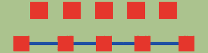
Visibly connected elements are perceived as more related than unconnected elements. This supports timelines, steppers, dependency maps, and tab-to-content relationships.
A line, shared edge, or other connector is a visible claim about structure. Use one only when the relationship is real, and make its endpoints clear. A connector that crosses unrelated content or stops ambiguously can imply an order or dependency that does not exist. When several kinds of connection appear together, their treatments should remain consistent enough that people can distinguish sequence, hierarchy, and selection.
Law of Prägnanz

People tend to interpret ambiguous or complex forms as the simplest stable structure available. The design goal is to ensure that the simplest plausible interpretation is the correct one.
Clear alignment, restrained shapes, and consistent contours can support that interpretation. Competing boundaries, accidental overlaps, and unnecessary decoration can suggest a different structure from the intended one. Simplification is not the removal of all detail. Keep the distinctions required to understand the object or task, and remove visual information that creates a competing reading without adding meaning.
Closure

Closure allows people to perceive a whole object when parts of its boundary are absent. The remaining contour and context must provide enough information for the missing part to feel intentional.
This principle can keep an icon legible without drawing every edge. It can also suggest that cropped content continues beyond a visible boundary. Use it carefully at small sizes and around clipped content. If the shape has too little identifying information, or if spacing and alignment do not support the implied whole, the result can look broken. Closure fails when clipping looks accidental rather than deliberate.
Continuation

Continuation leads the eye along aligned lines or curves. It helps people follow a path through timelines, forms, charts, and sequences without treating every item as unrelated.
Alignment should reinforce the order in which information is read or acted on. A continuous line can connect steps, while a shared edge can link labels and values across repeated rows. Break the path when the relationship ends. If lines, curves, or alignments cross unrelated groups, they can imply a sequence or connection that the content does not support.
Common fate

Common fate groups elements that move together. Shared movement can show that several parts belong to one object, that a selection moves as a unit, or that content changed position during an animation.
Motion is therefore a claim about relationship, not decoration. Elements that travel together should have a reason to be read together. Items that represent different actions or states should not move in a way that makes them appear coupled. Common fate fails when motion implies false relationships, or when unrelated animation competes with the movement needed to explain a real change.
Figure-ground

Figure-ground distinguishes the current object of attention from its background. It helps people understand which layer is active, what can be acted on now, and what remains behind it.
Focus states, selections, sheets, and overlays all depend on a clear figure-ground relationship. Contrast, depth, dimming, and placement can establish that separation, but the active content must remain readable and the background must retain enough context to explain where the layer came from. The relationship fails when active and inactive layers have equal visual weight or when the background appears interactive while it is unavailable.
Visual hierarchy and salience

Visual hierarchy answers what should be noticed first, what is actionable, what belongs together, and what is exceptional. It uses relationships among size, position, spacing, typography, color, and containment to establish an order of attention.
Salience is the degree to which something attracts attention through contrast, size, isolation, position, motion, sound, haptics, novelty, or semantic importance. Salience should correspond to importance. A primary action may need more emphasis than a secondary one, while a destructive option may need clear recognition without becoming the screen’s main invitation.
Hierarchy should still work when content changes, text wraps, or values become unusually long. Several pulsing controls do not create several priorities; they create noise. Decide which element needs attention now, which information supports it, and which details can remain available without competing.
Aesthetic-Usability Effect

The Aesthetic-Usability Effect describes the tendency to perceive attractive products as easier to use. Coherent aesthetics can improve confidence and tolerance for minor friction.
That perception is not proof that the product works well. Beauty does not repair hidden actions, lost work, inaccessible contrast, poor recovery, or unclear state. Evaluate whether people can still understand, complete, and recover from the task. Use visual polish to support legibility, hierarchy, and trust, not to conceal unresolved interaction problems.
Von Restorff Effect

The Von Restorff Effect, or isolation effect, describes how a distinctive item attracts attention and may be remembered more readily. It can emphasize a primary action, warning, current selection, or abnormal value.
Distinctiveness depends on contrast with the surrounding set. Color, shape, position, scale, or spacing can create it, but the difference should communicate a real priority or state. The effect fails when everything is highlighted because nothing remains isolated. Color should also not be the only distinguishing cue when the difference must be understood. Reserve exceptional treatment for elements that genuinely need exceptional attention.
Takeaways
- Use images when they add meaning, not as automatic replacements for words.
- Use space to communicate relationships.
- Reserve containers for meaningful groups.
- Make visual similarity correspond to behavioral similarity.
- Ensure emphasis reflects importance.
- Let aesthetics support comprehension without treating polish as proof of usability.
Further reading
Memory, attention, habits, and cognitive load
Cognitive load
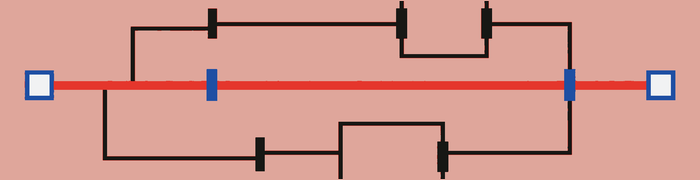
Cognitive load is the mental effort required to understand and perform a task. Some complexity belongs to the task. Other complexity is introduced by ambiguous language, hidden state, unexplained modes, repeated entry, inconsistent behavior, comparison across screens, irrelevant decisions, and required memorization.
The goal is not to make every interface sparse. It is to remove mental work that does not help users reason about the real problem.
Cognitive load should not be presented as a simple ranking of cognitive, visual, and motor burdens. These are different interaction costs that trade off according to task and context. A few additional taps may reduce difficult reasoning, but “more clicks beats more thinking” is not a universal rule.
Working Memory and Miller’s Law

Working memory temporarily holds and manipulates information needed for the current task. An interface consumes it when people must carry a value to another screen, remember an earlier choice, compare separated options, or reconstruct what changed after an interruption.
Miller’s Law is commonly summarized as seven items, plus or minus two. That number should not become a rule for menu length. Capacity depends on familiarity, representation, chunking, rehearsal, distraction, and task conditions. A short list of unfamiliar choices can demand more effort than a longer, well-organized list.
The durable lesson is that an interface should not make people remember information it can keep visible. Preserve entered values, show current selections and constraints, place comparison information together, and retain enough context for people to resume after leaving the task.
Recognition rather than recall

Recognition uses visible cues; recall requires retrieving information without them. Interfaces support recognition through recent searches, suggestions, visible selections, history, thumbnails, examples, saved recipients, comparison views, command palettes, and visible shortcuts.
Choose cues that match what the user is trying to identify. A thumbnail supports recognition of an image, while a name may be better for a command or person. Keep relevant choices and prior state available at the point of action. Recognition does not require exposing every possibility at once; search, grouping, and progressive disclosure can keep cues available without turning the screen into an unstructured catalog.
Chunking and cognitive offloading

Chunking groups smaller pieces into meaningful units. Useful chunks reflect the user’s task, not an arbitrary item count. A group needs a clear internal relationship and a boundary that distinguishes it from the next part of the task.
Cognitive offloading uses the environment as external memory. Drafts, autosave, checklists, notes, saved filters, recent items, comparison trays, visible calculations, progress, reminders, undo history, and restored scroll position all reduce recall. These supports keep information or unfinished work available instead of asking the user to hold it mentally.
The two ideas solve different parts of the same problem. Chunking makes information easier to organize and scan. Offloading keeps needed information and state available over time. Use both when a task requires several values, decisions, or sessions.
Procedural memory, muscle memory, and habit
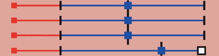
With repetition, an action can shift from deliberate control toward procedural memory and habitual execution. In interface work, this learned fluency is often called muscle memory. Stable placement and consistent sequences let frequent users act with less conscious effort.
That fluency creates a tradeoff. Moving a familiar control or changing the order of actions can cause users to execute the old sequence automatically. These are often capture slips rather than failures to understand.
When changing an established workflow:
- Preserve location and sequence when there is no clear benefit to change.
- Make consequential changes visibly distinct.
- Avoid moving destructive actions into a familiar target’s position.
- Provide undo for a meaningful sequence, not only one isolated step.
- Give users time and cues to form the new habit.
Selective attention and peripheral attention
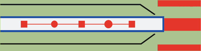
Selective attention means people focus on a subset of available stimuli, usually those connected to their immediate goal. A visible message can still be missed when attention is on a field, object, or control elsewhere.
Peripheral attention describes sensitivity to change outside the exact focal area. Peripheral movement can capture attention quickly, which is why unrelated animation near the edge of a screen disrupts concentrated work. Place feedback near the action or object it describes so the user does not have to monitor a distant region.
Do not use peripheral sensitivity as justification for blinking interface elements. Blinking and repetitive motion can distract, create habituation, and cause accessibility problems. Use localized, proportionate changes near the relevant task, and reserve broader interruption for information that truly requires attention.
Inattentional blindness and change blindness

Inattentional blindness occurs when focused attention causes an unexpected element to go unnoticed. Change blindness occurs when users fail to perceive a change, especially during interruption, animation, loading, or visual disruption.
The difference matters when diagnosing a missed update. An unexpected control may never enter attention, while a value that was already present may change without the user detecting it. Making either one technically visible does not guarantee that it will be noticed.
Preserve position when continuity matters. Animate meaningful movement, briefly highlight changed values, explain why an item moved, and avoid refreshing content beneath the user’s finger. Put the explanation near the changed object and keep it long enough to be understood. For consequential changes, use more than a subtle visual difference and leave a stable record of the new state.
Signal detection
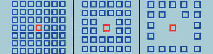
Signal-detection theory provides a useful way to think about whether people can distinguish an important signal from background noise. Stronger signals may improve detection but can also create more false alarms or interruption. Detection depends on both the signal and the noise around it.
Design implications include:
- Match signal strength to consequence.
- Reduce irrelevant competing signals.
- Use more than one cue for critical states.
- Avoid making ordinary events look urgent.
- Reserve persistent interruption for states that require action.
Serial Position Effect

The Serial Position Effect describes stronger memory for items near the beginning and end of a sequence. Place essential orientation early and end flows with a clear result and next step, but do not turn the effect into a mechanical layout formula.
The middle of a sequence still needs clear labels, grouping, and access. Do not hide a required choice there and assume its position explains missed decisions. Apply the effect as a prompt when ordering instructions, steps, or summaries: establish context at the start, keep the path understandable throughout, and make the ending confirm what happened and what the user can do next.
Zeigarnik Effect

The Zeigarnik Effect describes the tendency for incomplete or interrupted tasks to remain mentally active. Treat this as context for resumption, not as a demand for completion. The interface should still preserve the information needed to return.
Draft indicators, visible progress, saved state, and a direct route back can support resumption. Show what remains without implying that every started task must be completed. Optional work should not be framed as defective merely to generate anxiety. Avoid false urgency, repeated badges, or incomplete-profile warnings that turn a memory aid into pressure. The goal is to make return easier, not to keep the product mentally intrusive.
Prospective memory

Prospective memory is remembering to act later. Reminders, due dates, follow-up states, scheduled actions, and saved progress move that burden into the product.
A useful support identifies what needs to happen, when it matters, and where to continue. It should preserve enough context that the user does not have to reconstruct the original task. Let people choose, reschedule, complete, or dismiss reminders when those actions fit the work. Not every unfinished task needs a notification, and repeated prompts can create noise rather than support. Use prospective-memory aids for commitments the user recognizes, with timing and persistence proportionate to their consequences.
Habituation and interruption

Repeated exceptional signals become ordinary. Users stop reading constant warnings, banners, tooltips, and “urgent” notifications. Increasing the volume or frequency does not restore meaning if the same presentation appears for routine events. Reduce competing signals and reserve exceptional treatment for exceptional conditions.
Task switching also has a reconstruction cost. After an interruption, people may need to find their place, recall the goal, and check whether their last action took effect. Products should avoid unnecessary interruption and preserve the user’s place when interruption is unavoidable.
When a task must be interrupted, explain the reason and immediate choices. Preserve entered data, selection, scroll position, and pending state where possible. Give the user a clear route back instead of forcing the task to restart. Interruption should match the consequence and leave recovery intact.
Attention span

There is no reliable universal rule that attention lasts seven, ten, or fifteen minutes. Attention varies with motivation, task difficulty, fatigue, environment, interaction, and presentation.
Long experiences should be segmented around meaningful changes in activity, opportunities to act, natural milestones, and user-controlled breaks rather than a fixed timer. The right segment may be short for a demanding decision and longer for focused work. Watch for the points where the task changes or users need feedback, not a folklore countdown. Let people pause without losing progress, and make it clear what has been completed and where they can resume.
Takeaways
- Keep state and comparison information visible.
- Design for recognition before recall.
- Preserve stable placement where habit is valuable.
- Treat rearrangement as a potential source of slips.
- Place feedback where attention already is.
- Reserve exceptional presentation for exceptional conditions.
- Do not use a fixed attention-span number as a design law.
Further reading
Choice, judgment, motivation, and autonomy
Hick’s Law
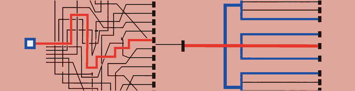
Hick’s Law describes how decision time generally increases with the number and complexity of choices. Ten clearly differentiated options may be easier than four vague ones because count alone does not determine the work required to decide.
Reduce decision effort by removing irrelevant choices, grouping related options, clarifying differences, providing meaningful defaults, supporting search and filtering, and deferring choices that are not yet necessary. Keep the user’s goal and current context visible while choices are presented. Do not split a coherent decision across extra screens merely to make each screen look simpler. The useful measure is whether people can understand the alternatives and choose with proportionate effort.
Choice Overload
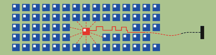
Choice Overload describes situations in which a choice set makes selection more difficult, less satisfying, or easier to abandon. The effect is conditional. Difficulty increases when users lack stable preferences, options are hard to compare, consequences are uncertain, or differences are poorly structured.
The goal is not always fewer choices. It is better-supported choice. A large set can remain manageable when categories, search, filters, comparison, and recommendations reflect the user’s goal. A small set can still be difficult when labels are vague or tradeoffs are hidden. Remove options that do not belong, but preserve meaningful alternatives and make their differences clear.
Cognitive Bias

Cognitive Bias is an umbrella term for systematic influences on judgment:
- Anchoring: An initial number or option becomes a reference point for later judgment. A pricing page can create an anchor with its first plan or a crossed-out price; use reference points that are real and comparable rather than fabricated values.
- Framing: Equivalent outcomes can feel different depending on how they are presented. A product may emphasize a monthly payment while obscuring the annual total, or foreground gains while hiding risks; present material benefits, costs, and consequences in terms that support fair comparison.
- Default effect: People often retain a preselected option because it saves effort and can signal a recommendation. Use defaults for common, low-risk, reversible settings, but require an active choice for optional charges, consent, privacy, or audience changes.
- Status quo bias: Existing conditions can feel safer than changing them, especially when the outcome is unclear. When asking people to switch plans, settings, or workflows, explain what will change and what will remain; do not make keeping the current choice deliberately difficult.
- Loss aversion: Potential losses can carry more weight than equivalent gains. Cancellation flows often exploit this by dramatizing what will disappear; describe the real consequences neutrally and distinguish lost benefits from data or account access that will remain.
- Ambiguity aversion: People often avoid options whose outcomes or likelihoods are unclear. Vague plan names, permissions, and sharing controls can push them toward a familiar option or abandonment; explain scope, likely consequences, and recovery before asking for commitment.
- Social proof: Other people’s behavior can reduce uncertainty, especially when their situation is relevant. Labels such as “most popular” should have a truthful basis and should not replace a clear explanation of tradeoffs or expose private behavior.
- Scarcity: Limited availability can increase urgency and reduce deliberation. Show genuine stock limits and deadlines only when they are accurate and current; do not use resetting timers, vague demand claims, or pressure that prevents comparison.
These influences often overlap. A pricing screen might anchor judgment with an expensive first plan, frame an annual commitment as savings, preselect it, call it popular, and add an expiring offer. Review the complete path rather than one control in isolation. Choice architecture cannot avoid influence, but it can make the comparison basis, default, evidence, and consequences clear while keeping alternatives and refusal within easy reach.
Smart defaults and anticipatory design
A smart default reflects a high-confidence, safe prediction of likely intention while remaining easy to change. Anticipatory design supports the probable next action before the user explicitly requests it. Autofocusing the only text field in a naming sheet is a small example.
A missed default occurs when the interface has strong evidence of the intended action but requires unnecessary specification. Good defaults should be visible in context, reversible where possible, and easy to replace. A prediction should save work without hiding what the product chose.
Prediction becomes dangerous when it changes cost, privacy, audience, or irreversible state. Consequential decisions require explicit understanding. When confidence is low, offer a suggestion instead of acting. When a choice affects other people or creates an ongoing commitment, show its scope before the user confirms it.
Need for control, autonomy, and reactance
People need practical control over pace, commitment, automation, privacy, and reversal. Good defaults and automation should reduce effort without making users feel trapped. Control does not require exposing every internal setting. It requires clear ways to understand, change, stop, or undo decisions that materially affect the user.
Reactance is resistance produced when freedom appears restricted. Repeated permission requests, hidden dismissal, mandatory tutorials, forced personalization, judgmental rejection labels, and settings that re-enable themselves can all provoke it.
Offer a real skip or decline path when participation is optional. Let people review automated actions and change future behavior. Use direct, neutral labels for acceptance and rejection. If a constraint is necessary, explain it at the point where it applies and preserve every legitimate alternative.
Cognitive dissonance, effort justification, and post-decision rationalization

Cognitive dissonance is discomfort created by conflicting beliefs, actions, or evidence. People may reduce it by changing a belief, reinterpreting evidence, or rationalizing a previous decision.
Effort justification is a related tendency to assign greater value to an outcome after investing substantial effort. Post-decision rationalization may cause people to defend a purchase or minimize the importance of alternatives. Keep terms and consequences visible while the choice is still reversible.
The concepts help explain behavior after difficult onboarding, purchases, or commitments. They should not justify intentionally adding friction to manufacture attachment. A product that makes cancellation or joining needlessly difficult is creating burden, not meaningful value. Support informed decisions before commitment, and make review, correction, and exit clear afterward. Do not treat prior effort as permission to demand more.
Social identity, in-group trust, and social proof

People may weigh behavior or recommendations from friends, colleagues, family members, or relevant peers more heavily than anonymous popularity. This can make “people on your team use this template” more useful than “one million users chose this.”
Social proof supplies evidence from other people’s behavior when a decision is uncertain. Social identity can make that evidence feel more relevant when it comes from a group the user recognizes as their own. The relationship must be real; a broad popularity count should not be presented as a personal connection.
Social context should be truthful, relevant, privacy-preserving, and noncoercive. Identify the source and scope of the signal when that context affects its meaning. Do not expose private activity, fabricate popularity, or use in-group pressure to obscure the user’s own interests. Leave the underlying options and tradeoffs clear enough to judge without the social cue.
Goal-Gradient Effect

The Goal-Gradient Effect describes increasing motivation as a goal appears closer. Use real milestones, visible remaining steps, resumable progress, and honest completion conditions.
Progress should correspond to work the user recognizes. If steps are optional, branching, or unequal, the indicator should not pretend they are fixed and identical. Show what has been completed, what remains, and whether the task can be paused. Do not invent progress, start a meter before meaningful work has occurred, or treat optional fields as required. The effect can support momentum, but the interface still needs an accurate account of the path to completion.
Peak-End Rule
The Peak-End Rule describes how memory of an experience is strongly influenced by intense moments and its ending. Payment, failure, recovery, cancellation, export, deletion, and completion deserve special care because they can become those memorable points.
Make high-stakes moments clear, calm, and recoverable. End a flow by confirming what happened, preserving evidence when useful, and providing the next appropriate action. Do not use a polished completion screen to compensate for avoidable friction or harm earlier in the experience. The rule is a prompt to examine memorable moments, not permission to neglect the full task.
Flow

Flow is concentrated engagement supported by clear goals, appropriate challenge, immediate feedback, and limited irrelevant interruption. Stable workspaces, short feedback loops, safe experimentation, and predictable controls support it.
Design can create favorable conditions but cannot guarantee that every person enters the same state. Keep the task’s goal and progress legible, match available guidance to the user’s skill, and avoid taking focus for unrelated messages. Let repeated actions become efficient without hiding controls needed for recovery. When the work itself requires concentration, the interface should remain responsive and available without repeatedly asking for attention.
Satisficing and the principle of least effort
Satisficing means choosing an option that is good enough for the current goal rather than exhaustively identifying the theoretical optimum.
The principle of least effort describes a tendency to prefer paths that achieve an acceptable result with proportionate cost. This connects to information foraging: people pursue a path when its expected value appears worth the effort. A person may stop once the answer, product, or setting meets the need, even if deeper comparison remains available.
Design for this behavior with:
- Strong information scent
- Safe defaults
- Efficient common paths
- Clear stopping conditions
- Search and filtering
- Comparison when optimization genuinely matters
Do not assume that “least effort” means laziness. People allocate limited time and attention according to goals and consequences. Make the common good-enough path clear, and preserve deeper controls for cases in which precision or optimization is worth the added work.
Takeaways
- Improve comparison before simply removing options.
- Use defaults to save effort, not obtain passive consent.
- Explain recommendations and consequential predictions.
- Preserve autonomy and accept rejection.
- Treat social influence as context, not pressure.
- Support good-enough decisions while enabling deeper comparison when valuable.
Structuring the experience
Information architecture and sense of place
Information architecture

Information architecture is the organization, grouping, labeling, and connection of content, features, and destinations. A useful architecture reflects user goals and domain relationships rather than internal teams, databases, or implementation boundaries.
Start with the concepts and tasks people use to describe their work. Group related material, give each group a clear name, and connect destinations that belong together. The resulting structure should help someone choose a path without first understanding how the company or product is organized. When architecture follows implementation boundaries instead, people must translate their goal into the system’s private structure before they can move forward.
Information scent
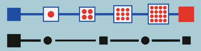
Information scent is the user’s estimate of what a label, link, icon, or result will lead to. Strong scent is specific: “Download invoice” is stronger than “More.”
A useful label tells people enough about the destination or result to decide whether following it is worthwhile. Judge labels in their actual context, because an icon or word that seems clear alone may compete with nearby choices. For links and results, name the subject and expected action when space allows. Generic terms make people inspect more possibilities; specific terms help them choose with greater confidence.
Sense of place
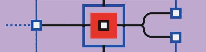
Sense of place is the user’s understanding of where they are, how they arrived, what scope is active, where they can go next, and what Back will do.
Keep those answers visible through the page title, selected navigation, breadcrumbs, scope labels, and a stable route back when they fit the product. A detail view should still make its parent or collection understandable. A filtered result should still show the active scope. Each cue should agree with the others so the interface communicates one location and one route through it.
Mixed navigation semantics

Mixed navigation semantics occur when controls in one system perform conceptually different jobs. If four tab-bar items open destinations and the fifth opens a command menu, the fifth violates the model established by the others.
Controls grouped as peers should set the same kind of expectation. Keep destination controls with destinations and place commands where their action role is clear. If a product must mix roles, make the difference visible before interaction. Do not require people to discover the changed meaning by triggering the control.
Broad and deep structures
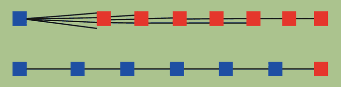
Broad structures expose more choices at each level. Deep structures expose fewer choices but require more traversal. Neither is inherently superior. The number of clicks is not a reliable quality measure; path clarity and confidence matter more.
Choose breadth and depth according to how well people can understand the available groups and predict the next level. A broad level is not useful if its choices are difficult to distinguish. A deep path is not automatically difficult if each step is clear and keeps the destination understandable. Evaluate the whole route, not its click count alone.
Search
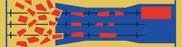
Good search supports typo tolerance, synonyms, suggestions, history, match highlighting, clear scope, filters, useful ranking, query preservation, and alternatives when no exact result exists.
These parts should work as one path from query to result. Suggestions can help people express a query, while highlighting and ranking help them judge the returned set. Scope and filters explain what was searched and what remains included. Preserving the query lets people revise it without starting again. When no exact result exists, useful alternatives should explain what the system can offer instead of presenting an unexplained dead end.
Filtering
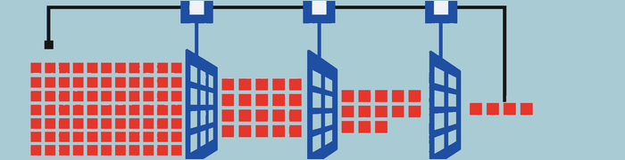
Filtering should keep active state, combination logic, result count, current sort, and reset behavior visible. People need to know which filters are applied, whether multiple choices broaden or narrow the set, and how sorting affects what appears first.
Show the effect of the current combination without making users remember earlier selections. Reset should have a clear scope, especially when filters and sort settings can both change the result set. A visible, readable state makes it possible to adjust one part of the query without rebuilding the rest.
Back and state restoration
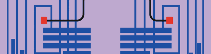
Back should restore prior scroll position, search query, filters, selection, relevant tab, and modal layer. Returning to a reset root forces users to reconstruct their place.
Treat Back as a return to the previous working context, not only as a route to the previous destination. If someone opens a result from the middle of a filtered list, returning should preserve the list and the position from which they left. The same principle applies across tabs and temporary layers: restore the state that explains where the user came from and what they were doing.
Takeaways
- Organize around user concepts and tasks.
- Use labels with strong information scent.
- Keep current location and scope visible.
- Give controls within one navigation system consistent semantics.
- Preserve search, filter, selection, and scroll state.
Further reading
Spatial continuity and interaction models
Broken spatial model
A broken spatial model occurs when the interface does not maintain a coherent relationship between screens, menus, objects, and destinations. The required content may still be present, but the connections no longer form a stable model.
A control might appear to open a nearby layer and instead replace the whole workspace, or a destination might lose every visible connection to the object that opened it. Keep these relationships consistent enough that people can predict what will remain, what will change, and how they can return to the point where the interaction began.
Spatial continuity, object constancy, and context preservation
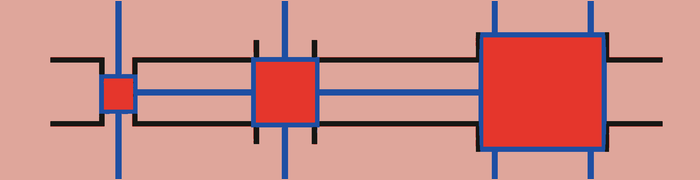
Spatial continuity preserves a visible relationship between an interaction’s origin and result. Object constancy helps users perceive an element as the same object while its size, position, or state changes. Context preservation keeps enough of the previous interface visible or conceptually connected to explain the new content.
These ideas support the same goal from different directions. Spatial continuity explains where a result came from. Object constancy explains what changed. Context preservation explains how the new view relates to the work around it. A selected item might expand into a detail view while retaining its identity and some sign of the collection behind it. The transition does not need to keep every earlier element on screen. It needs to preserve the relationships required to understand the change and return from it.
Hard cuts and forced reorientation

A hard cut immediately replaces one interface with another. It becomes disorienting when users need to understand origin, hierarchy, or identity. Forced reorientation is the mental work of reconstructing location after such a transition.
When a replacement is necessary, retain enough stable information to connect the two views. A shared title, recognizable object, navigation state, or clear return path can carry context across the cut. The goal is not to animate every change. It is to avoid making people rebuild the product’s structure each time the interface moves them somewhere new.
Motion
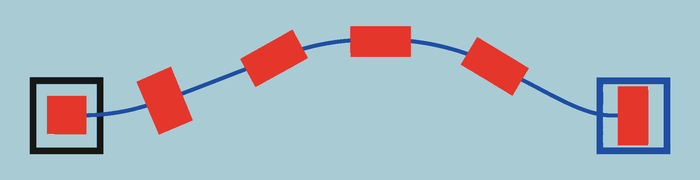
Motion can communicate cause and effect, origin and destination, hierarchy, identity, added or removed state, navigation direction, and commitment. It should follow the interaction logic so the movement explains what changed instead of decorating the change after the fact.
Use direction and continuity consistently with the product’s spatial model. An element that moves, expands, or leaves should remain understandable as the same object or as the result of a specific action. Motion should also respond to reduced-motion preferences. Preserve the information the transition carries even when the amount or type of movement is reduced.
Direct manipulation

Direct manipulation lets users act on visible objects with immediate feedback. It works best when boundaries are visible, actions are reversible, and precision demands are reasonable. The object, valid range, and current result should remain clear while the action is in progress.
Dragging should not be the only route to an important result. Provide another control that reaches the same outcome without requiring the same movement or precision. Direct manipulation should make an action easier to understand, not turn a required task into a test of dexterity or make recovery depend on a perfectly executed gesture.
Further reading
Progressive complexity and learnability
Progressive disclosure

Progressive disclosure presents essential or common options first and reveals specialized controls when needed. It lets a person begin with the decisions required for the current task while keeping additional capability available.
It should defer complexity, not truth. It becomes harmful when it hides primary actions, material pricing terms, validation rules, destructive consequences, or frequently needed capabilities. Those details affect whether a person can understand or safely complete the task, so they cannot be treated as optional depth.
Staged disclosure divides a process into sequential steps. Contextual disclosure reveals controls or guidance when they become relevant. In either form, the next step and the route to additional options should remain clear. Disclosure works when it changes when complexity appears, not when it makes important information difficult to find.
Scaffolding and progressive reduction
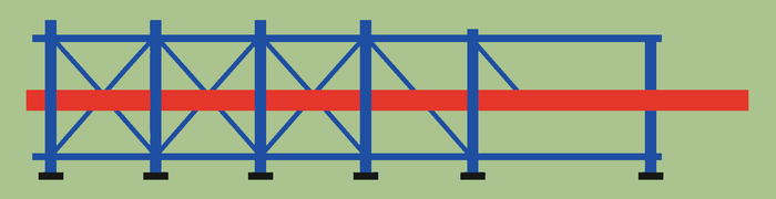
Scaffolding provides examples, suggested values, helper text, sample content, templates, guided practice, explanatory labels, and safe defaults while users learn. It supports the real task instead of asking people to study the product before using it.
Progressive reduction decreases guidance as familiarity develops. The product might shorten repeated instruction or make optional help less prominent once a person has shown that it is no longer needed. Core meaning and access should remain intact.
Reduction must be based on credible familiarity. Removing labels after one visit can punish infrequent use, and a completed action does not prove that the person understood it. Reduce only the support that has become unnecessary, while keeping guidance easy to recover when the task, context, or user’s needs change.
Observational learning
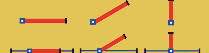
Observational learning occurs when people learn by watching an action or process rather than relying only on verbal description. Demonstrations are especially useful for gestures, physical procedures, spatial transformations, and multi-step creative work.
Useful implementations include:
- A short demonstration beside the real control
- Worked examples that expose decisions
- Guided practice using actual content
- Before-and-after previews
- Replayable gesture demonstrations
The demonstration should remain connected to the task it explains. People should be able to inspect the sequence, try it with real content, and replay it when needed. A result alone is not enough when the important lesson is how the result was produced.
Observational learning is a stronger and safer design concept than attributing imitation and empathy to a simple “mirror system.” Neuroscience may inform hypotheses, but the design recommendation does not require a broad claim about dedicated mirror neurons.
Paradox of the Active User

The Paradox of the Active User describes how people begin trying to accomplish their goal rather than first reading complete instructions. Design for that behavior by placing instruction inside the work instead of depending on a complete lesson before it.
Teach through safe exploration, examples, undo, contextual help, and replayable guidance. Guidance should answer the question created by the current step and leave the person able to continue the real task. If instruction appears before its meaning is clear, keep it available so the user can return when the need becomes concrete.
Onboarding, permissions, sign-in, and empty states

Effective onboarding gets users to a meaningful result while teaching only what is required. It should support the first real task rather than make completion of a tour the goal.
Permission requests should appear when the user invokes the related value. At that point, the interface can connect the request to what the person is trying to do. Require identity early only when the task inherently depends on it, and preserve work across registration so sign-in does not erase progress already made.
An empty state should distinguish among a new account, no search results, no filtered results, completed work, permission denial, offline state, and loading failure. These conditions may look equally empty, but they call for different explanations and next steps. Name the condition that applies, preserve any relevant query or filter state, and show a route that fits that state.
Further reading
Complexity and prioritization
Tesler’s Law

Tesler’s Law, or conservation of complexity, proposes that some complexity cannot be removed from a task. Design still determines who handles it, when they handle it, and whether the work is visible. A system can absorb complexity through sensible defaults, automation, validation, and clear recovery. It can also push that complexity onto the user through unexplained rules or a long sequence of decisions. A sparse screen is not necessarily a simple experience. If the interface hides the work while leaving people to discover it later, the complexity has moved rather than disappeared.
Occam’s Razor
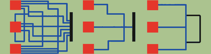
Occam’s Razor favors the simplest explanation or solution that adequately fits the problem. In interface design, this means removing distinctions and steps that do not help people act or understand, not pursuing the fewest visible elements. A label may be simpler than an unfamiliar icon because it removes interpretation. A status message may be simpler than forcing someone to check whether an action succeeded. Compare alternatives by the total effort they create, including learning, error recovery, and uncertainty. The simplest adequate design keeps the information and controls the task actually needs.
Pareto Principle

The Pareto Principle is a useful prompt to identify the small set of workflows that account for much of a product’s routine use or value. Those paths deserve careful placement, speed, and testing. The principle is a prioritization heuristic, not a reason to discard everything outside the majority case. A rare action can still carry serious financial, privacy, safety, or recovery consequences. Accessibility needs and minority workflows do not become optional because they occur less often. Prioritize common work without making uncommon but legitimate work impossible, hidden, or dangerously fragile.
Parkinson’s Law
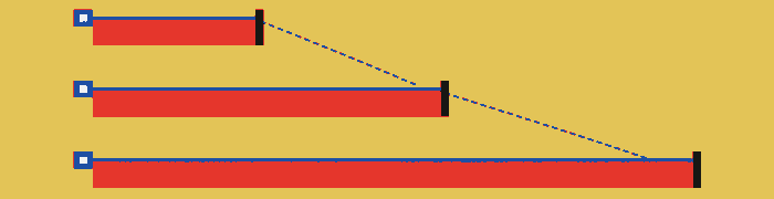
Parkinson’s Law says that work tends to expand to fill the time available. Open-ended interface tasks can produce the same effect when people cannot tell what “done” means or how much judgment a decision requires. Give the work useful boundaries: state the completion criteria, divide large tasks where the divisions clarify progress, offer templates for repeated work, and make the next decision explicit. A deadline alone does not create clarity. The interface should reduce unnecessary interpretation while leaving enough room for work that genuinely needs care, review, or exploration.
Postel’s Law

Postel’s Law supports accepting harmless variations in input while remaining strict about meaning, security, and data integrity. A form can ignore extra spaces, normalize familiar phone-number formatting, or accept capitalization differences without making the user repair them. Tolerance should not silently reinterpret a consequential value, weaken validation, or accept ambiguous instructions that could affect the wrong object. Normalize what is clearly equivalent, explain what is not, and preserve the original input when correction is needed. A forgiving interface reduces clerical friction without becoming unpredictable about the result.
Designing interaction
Touch, movement, and mobile ergonomics
Targets and spacing

Fitts’s Law describes how target-acquisition time depends on the size of a target and the distance required to reach it. Frequent and important controls should be comfortably large and placed near the work they affect. The visible shape and the interactive region do not have to be identical; a small icon can sit inside a larger hit area, provided nearby controls do not overlap it.
Spacing matters alongside size. Two generous targets can still be dangerous when their boundaries touch and their consequences differ sharply. Separate opposing actions such as Delete and Save, especially near screen edges or in moving layouts. Use placement, grouping, and consequence together when deciding how much room a control needs. Target guidance is a minimum, not a substitute for testing with real hands, devices, posture, and motion.
Steering constrained movement

The Steering Law concerns movement through a constrained path. Long, narrow paths demand more precision and take longer to traverse without crossing a boundary. The effect appears in sliders with tiny tracks, narrow drag corridors, cascading menus, crop handles, and drawing tools. Widen the usable path, enlarge handles, add snapping, and tolerate small departures that have only one reasonable interpretation. When precise steering is not the point of the task, provide another method such as direct numeric entry, step controls, or a Move command.
Reach is contextual
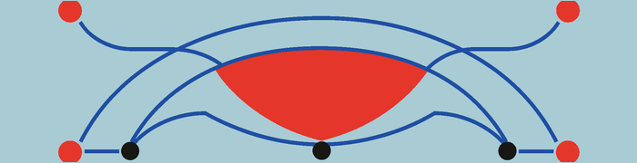
Reach changes with device size, hand, grip, posture, mobility, and environment. A control that is easy to reach while seated with two hands may be difficult while walking, carrying something, or using a larger phone with one hand. Place frequent actions where they can be reached without changing grip, but do not treat any universal thumb map as a complete answer. Continue, Cancel, Back, and Dismiss should not depend on one distant corner. Provide equivalent routes when reach, orientation, or assistive technology changes how the screen is operated.
Gestures need visible alternatives
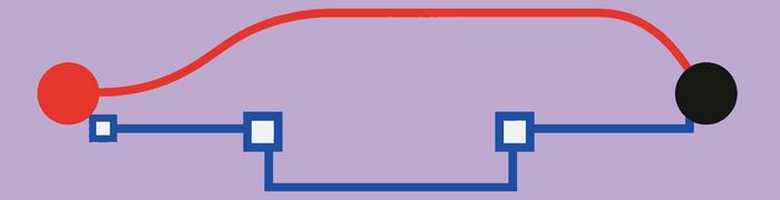
Gestures can make repeated work fast because they act directly on content and require little chrome. They are poor sole entry points because their availability, direction, and consequence are often invisible. Use gestures as accelerators for actions that are also reachable through visible controls. Pair swipe with an Edit or actions menu, drag with Move commands, pinch with zoom controls where precision matters, and long press with ordinary selection or menu access.
Alternatives should reach the same outcome, not a reduced version of it. They also need consistent labels and state so that learning one route helps with the others. When a gesture is central to a new interaction, teach it in context, let people recover from mistakes, and avoid requiring it for destructive or time-sensitive work.
Guard input during transitions
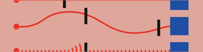
Interfaces need to distinguish intentional input from movement, repetition, and timing accidents. A scroll should not become a tap when the finger lifts. A delayed touch should not activate a control that appeared on a new screen. Submission should resist accidental duplication, and controls should not move beneath a finger during animation. Disable or debounce only for as long as the system needs protection, then make the resulting state clear. Input guarding should prevent the wrong action without making a responsive interface feel unresponsive or concealing whether the first action was received.
Focus, initial focus, and autofocus

Focus management determines which element is ready for keyboard, switch, remote, or assistive-technology interaction. Focus should follow a meaningful sequence, move into newly presented modal content, and return to the initiating context when that content closes. A visible focus indicator must remain easy to locate as the interface changes.
Initial focus is the element selected when a view first appears. Choose it to establish context and support the likely next action, not simply the first item in the code. Autofocus places focus in an input automatically. It works when text entry is the clear and immediate purpose, such as a dedicated search view. It becomes harmful when it opens the keyboard before people can read the page, shifts the layout, skips important context, or creates an accidental editing state.
The keyboard changes the layout

The software keyboard is a layout state, not an overlay to ignore. When it appears, the active field, its label, validation message, and relevant action should remain understandable and reachable. Test small screens, larger text, sheets, landscape, hardware keyboards, and keyboards that provide suggestion or accessory rows. Use the keyboard type and platform content type that fit the requested data. Make Next and Submit behavior logical, preserve entered values during resizing, and ensure dismissal does not become the only way to find the action that completes the form.
Further reading
Feedback, system state, time, and sensory delight
Visibility of system status

The interface should communicate its current state and the result of actions at an appropriate time and level of prominence. A pressed state acknowledges contact; a pending state says that work continues; a completion message confirms the outcome. Feedback should appear near the affected object when that relationship matters and at the application level when the state affects everything. Do not make people infer success from a button that simply stopped responding. The message, placement, and duration should match the consequence and the time the information remains useful.
Doherty Threshold

The Doherty Threshold emphasizes how rapid response sustains productive interaction. The exact timing is less important than the underlying behavior: acknowledge input immediately, even when completion will take longer. A control can change state, an item can appear as pending, or a progress region can begin before the server finishes the work. Fast acknowledgement is not permission to claim success early. Separate “received,” “working,” and “complete” when those states differ, and keep the interface available for other safe work when the operation can continue in the background.
Perception of time
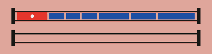
Perceived time depends on uncertainty, predictability, mental effort, control, feedback, and visible progress as well as objective duration. A short delay can feel long when people cannot tell whether the action was received, what the system is doing, whether it is advancing, or what will happen if it fails. A longer operation can feel manageable when its state and consequences are clear.
Acknowledge input immediately, preserve a stable layout, show meaningful progress, and set honest expectations. Let people leave safely when work can continue in the background, then provide a way back to the result. Breaking work into stages helps when those stages explain real progress or reduce uncertainty. Artificial steps that require more decisions make the wait busier without making it clearer.
Associative learning and conditioned cues
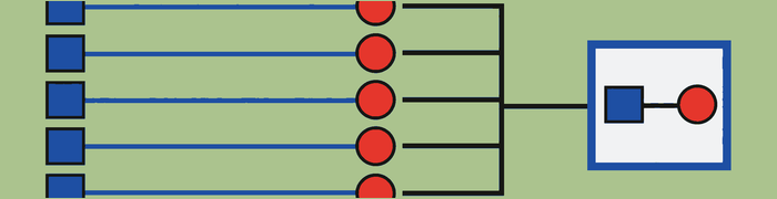
Through associative learning, a consistent cue can acquire meaning by repeatedly accompanying the same event. A particular haptic may come to mean that an object snapped into place. A short sound may signal completion. A stable color-and-icon combination may identify a sync conflict before the user reads its details.
The relationship must remain reliable. Reusing one cue for unrelated events weakens what people learn, while adding a cue to every minor event turns the set into noise. Match intensity to consequence and respect system settings for sound, haptics, and motion. A learned cue can make feedback faster to recognize, but it should not be the only carrier of critical meaning.
State completeness
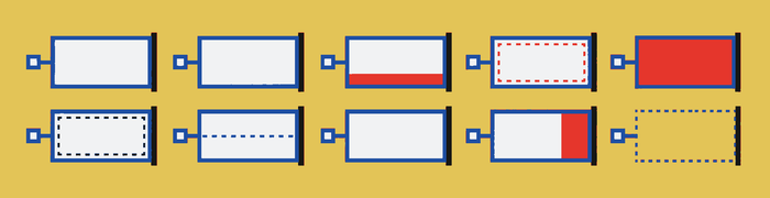
Design the states the real system can enter, not only the initial and successful ones. Relevant states may include pressed, focused, selected, disabled, loading, partially loaded, empty, success, warning, error, offline, stale, restricted, permission-denied, syncing, conflict, cancelled, and restored. Each state should answer what is true now, what changed, and what can happen next. Distinguish states that require different action. An empty account is not the same as an empty search result, and a disabled action is not the same as one blocked by missing permission.
Progress, skeletons, and optimistic UI
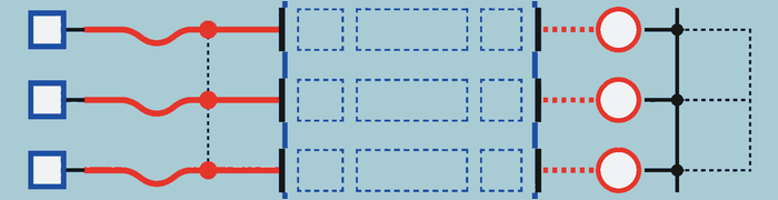
Use determinate progress when advancement can be measured honestly. Use indeterminate progress when the system knows work is happening but cannot estimate its duration. Do not display a precise percentage derived from guesswork. If progress stalls or changes phases, explain the state instead of letting the indicator imply movement that is not occurring.
Skeletons help when the arriving layout is predictable and content is likely to appear soon. Keep them stable and replace them with an error or empty state when loading does not succeed. They should not disguise an indefinite wait.
Optimistic UI works for reversible, low-risk actions with a high success rate. Show the pending state and provide correction if the operation fails. Do not present a financial transfer, purchase, scarce booking, permanent deletion, or sensitive submission as complete before the system has actually committed it.
Sensory delight
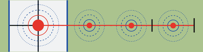
Sensory delight is the positive response created when visual, auditory, haptic, and motion feedback agree with an event. It can make an interaction feel responsive and cared for, but it earns that role by clarifying what happened. A snap can feel satisfying because its motion and haptic confirm placement. A restrained completion sound can close a task without demanding another glance.
Keep the response proportionate to the event and avoid delaying the next action. Respect sound, haptic, and reduced-motion preferences. Errors, payments, deletion, privacy decisions, and recovery usually need calm clarity before celebration. Pleasant surprise can enrich an interaction that already works. It cannot repair friction, conceal latency, or replace information the user needs to decide what to do next.
Toasts and banners
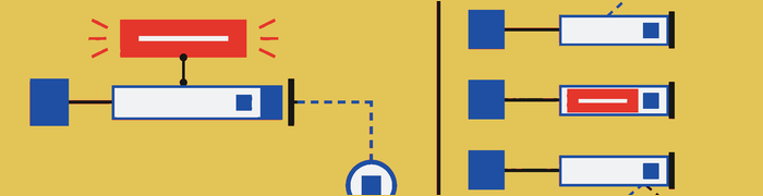
Transient messages fail when they disappear before they can be read, appear far from the action they describe, cover controls, or stack faster than people can process them. They also fail when they contain the only recovery path or are not announced to assistive technology. Use a toast for brief confirmation that does not require action. Use a persistent banner or inline message when the state continues, affects a region, or needs a response. Preserve important history somewhere durable when the message may matter after it leaves the screen.
Further reading
Forms, labels, and data entry
Language that identifies the answer
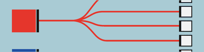
Semantic ambiguity occurs when interface language permits several reasonable interpretations. An underspecified label fails to identify the kind, scope, or format of the answer. “Name,” for example, may refer to a person, account, organization, or saved item depending on the task. Use domain language that matches how the intended users understand the subject, then add the qualification the decision actually requires.
Internal terminology is useful only when users share it. A field should not expose a database column, policy code, or operational distinction merely because the system stores one. Test labels alongside nearby choices and instructions, since meaning often changes with context. A good label lets someone predict what belongs in the control and how the value will be used.
Categories and values

Category-value confusion occurs when a category and one of its possible values are treated as if they mean the same thing. “Color” is a category; “Pink” is a value. The distinction affects labels, filters, empty states, and validation. A menu titled with the currently selected value may hide what kind of choice it controls, while a value presented as a category can make other valid options seem unrelated. Name the category where people need orientation, and show the current value as its state rather than as a substitute for the category itself.
Labels must persist
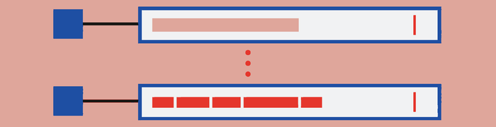
A placeholder should not be the only label for a field. It disappears during entry, often uses low contrast, and can make existing input look like an example instead of a value. Keep the label visibly and programmatically associated with its control before, during, and after editing. The relationship must survive text scaling, wrapping, validation, autofill, and changes in layout. Use placeholder text only for a short example or formatting hint when that help remains available elsewhere. Required status and instructions should also persist when the field contains a value.
Controls should match meaning and commitment
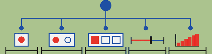
Choose controls according to the structure of the choice and when it takes effect. Checkboxes support independent selections. Radio groups expose a small set of mutually exclusive choices. A switch changes a persistent state immediately, so its label should describe the state rather than a command. A button commits an explicit action. Search or autocomplete can reduce scanning in a large set, while direct numeric entry suits values where precision matters.
The visual form of a control should not override its semantics. A row that looks like navigation but silently toggles a setting creates uncertainty about both location and state. Make the available choices, current value, and commitment point clear. When a change has cost or delayed effect, provide a review or explicit commit instead of borrowing the immediacy of a switch.
Defaults and tolerated variation
Defaults should save effort where a likely choice is safe and easy to inspect. They should not make consequential consent, payment, sharing, or renewal decisions for the user. Distinguish a recommended value from one that has already been selected, and preserve a deliberate change when the person returns to the step.
Accept harmless variations that do not change meaning. Phone-number punctuation, capitalization, extra spaces, and pasted formatting can often be normalized without interruption. Show the normalized result when it could surprise someone, and never use tolerance to guess among materially different values. A helpful default reduces routine entry; input tolerance reduces needless repair. Both must leave the actual decision visible.
Keep these behaviors consistent across entry, review, editing, and later import so accepted data does not become invalid simply because it arrived through another route.
Validate when the result can help

Validate when the system has enough information to give accurate, actionable guidance. Premature errors interrupt incomplete work, while validation only at final submission can force people to search the whole form for problems. Place the message near the relevant control, connect it programmatically, and explain what needs attention and how to correct it. Preserve every valid value and the user’s position after failure. If a rule depends on another field or a remote check, make the timing clear so a changing message does not look arbitrary.
Support credentials and autofill
Forms should cooperate with password managers, one-time-code autofill, contact and address autofill, secure paste, passkeys, and the platform content types that identify common data. These tools reduce memory demands and transcription errors, and they are often essential to completing a task with assistive technology or under time pressure. Do not block paste in password or verification fields without a genuine security reason. Keep field order and labels stable enough for autofill to map values correctly, then let people inspect and correct what was inserted before they commit.
Avoid redundant entry
Do not ask people to re-enter information already supplied during the same process. Carry it forward, show it for review where needed, and provide an Edit route back to its source. Repetition is justified when confirmation is essential, the value is security-critical, or the previous value is no longer valid, but it should not compensate for weak state management between steps. If data cannot be reused because of privacy, policy, or technical limits, explain the constraint before asking for it again and preserve everything else that can be kept.
Further reading
Errors, prevention, and recovery
Slips and mistakes
A slip occurs when the goal is correct but the action is wrong. Someone may intend to save a document and tap Delete because the controls are close together. A mistake occurs when the plan itself is wrong because the person’s understanding does not match the system. Someone may delete a local file believing a synced copy will remain.
The distinction changes the response. Slips benefit from larger targets, safer spacing, undo, input tolerance, and protection against duplicate action. Mistakes require clearer terminology, visible scope, better conceptual models, previews, and comparison before commitment. Do not treat every failure as carelessness. Identify whether the interface made execution fragile or made the likely outcome hard to understand.
The same surface can invite both, so diagnose the failure before choosing a remedy.
Prevent errors before commitment
Prevention is stronger than a message that arrives after damage. Use constraints, safe defaults, visible scope, previews, conflict detection, duplicate detection, formatting assistance, autosave, version history, and separation around destructive actions. A constraint should block states that are genuinely invalid without removing legitimate alternatives. A preview should expose the consequence that matters, such as the affected files or audience, not merely repeat the command. Prevention also needs an escape route: people should be able to revise the input, cancel safely, or recover when the system’s assumptions do not fit their case.
Undo and confirmation

Use undo for frequent, reversible actions where an interruption before every commitment would slow ordinary work. Make the result visible and keep the recovery available long enough to use. Undo should restore the affected object, state, and context rather than creating a second confusing version.
Use confirmation for rare, high-cost, or difficult-to-reverse actions. A useful confirmation names the action, object, scope, consequence, reversibility, and available alternative. “Are you sure?” adds no information. Avoid confirmations that appear so often people accept them by habit. When an action cannot be undone, explain that fact before commitment and consider a safer intermediate state, delayed execution, or recovery window.
Confirmation and undo can coexist when an action has both immediate and delayed consequences together.
Preserve work and context
Errors should not erase unrelated progress. Preserve form values, drafts, attachments, search and filter state, selection, scroll position, the object being edited, and the intended destination. Return focus to the place that needs attention and keep valid entries intact while the user repairs the problem. If a session expires or connectivity drops, save what can be saved and say what was not. Recovery is easier when people recognize the screen, can see the surviving work, and understand the smallest action required to continue.
Distinguish failure modes and partial success
Offline state, timeout, server failure, authentication expiry, permission denial, stale data, and sync conflict are different conditions. Name the one the system can identify and offer the action that fits it. “Something went wrong” is inadequate when retrying cannot solve the problem or could duplicate a completed operation.
Report partial work precisely. If nine files uploaded and one failed, preserve the nine successes and identify the remaining file. If the outcome is uncertain, do not label it failed or invite an unsafe retry until the system checks. Accurate state lets people decide whether to wait, reconnect, request access, resolve a conflict, or continue with unaffected work.
Keep the status attached to the affected objects so later recovery begins with evidence rather than memory.
Modes need visible boundaries
A mode changes what the same action means. Editing, selection, drawing, presentation, and command modes can support complex work, but they create errors when people cannot tell which interpretation is active. Show the mode persistently, make entry and exit predictable, and define its scope. Escape and Cancel should have safe, consistent meanings. Preserve unfinished work when leaving a mode where possible. If two modes make an identical gesture produce consequences of very different severity, consider distinct commands or an explicit transition instead of relying on memory.
Further reading
Quality and responsibility
Accessibility and inclusive interaction
Access changes with context

Accessibility concerns whether people can perceive, operate, understand, and reliably use an experience. A constraint may be permanent, temporary, or situational. The same person may use an interface differently because of an injury, bright sunlight, noise, motion, fatigue, a missing input device, or divided attention. Design for the capabilities the task requires rather than an imagined average user. Testing should include the settings, assistive technologies, input methods, environments, and content variations that materially change how the experience works.
Do not rely on one sensory channel

Do not communicate critical meaning through color, sound, haptics, or motion alone. Pair a color change with text, shape, iconography, or programmatic state. Pair an alert sound with a visible message. Ensure a haptic confirms an action that is also reflected in the interface. Multiple cues should agree rather than create separate meanings for different users. This does not require duplicating every decorative effect. It means that status, instructions, errors, and available actions remain understandable when one sensory channel is unavailable or intentionally disabled.
Text scaling must change the layout
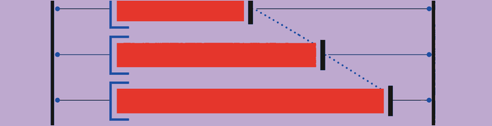
Larger text needs room to wrap and reflow. Test for clipped labels, overlapping controls, fixed-height rows, truncated actions, inaccessible navigation, and content that cannot scroll into view. Do not respond to text scaling by shrinking important type or hiding secondary words that carry meaning. A row may need to become taller, a horizontal group may need to stack, and a compact toolbar may need another presentation. Test the largest supported sizes with realistic long content and translated strings, not only with short placeholders.
Programmatic meaning and focus
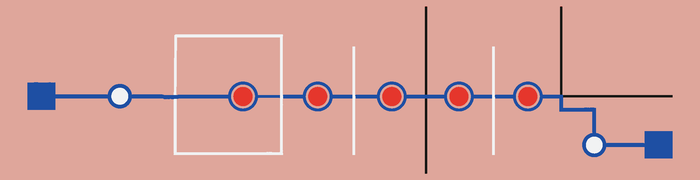
Assistive technology needs a programmatic name, role, value, state, and set of available actions for each meaningful control. Those properties should match what sighted users can perceive. A custom component that looks selected but does not expose selection state creates two different interfaces.
Focus order should follow a meaningful sequence that preserves relationships between headings, content, controls, and feedback. When a modal appears, move focus into it without skipping its context, keep navigation within it while it is active, and return focus to the initiating control when it closes. Dynamic updates should announce important changes without moving focus unexpectedly. Test the actual reading and action order instead of assuming source order is sufficient.
Keyboard and screen-reader testing should confirm that the visible and programmatic interfaces describe the same structure.
Reduced motion should preserve meaning
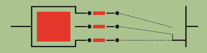
When reduced motion is enabled, replace large spatial movement, zooming, parallax, and repetitive animation with gentler alternatives. A dissolve, brief emphasis, or immediate state change can preserve the relationship without creating the same physical effect. Do not remove feedback entirely; people still need to know what changed and where new content appeared. Motion that is essential to understanding can remain in a restrained form, with controls to pause or stop it when appropriate. Test transitions as a complete sequence, not only individual animation durations.
Motor access and orientation
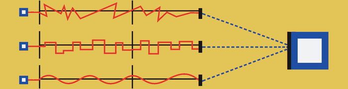
Provide comfortable targets and alternatives to dragging, multipoint gestures, shaking, fine path tracing, and edge gestures. A Move command, step control, direct value entry, or ordinary button can expose the same result without requiring precise motion. Avoid timing that requires rapid repeated input, and let people cancel or correct accidental activation. Support different grips, switch access, keyboard operation, voice control, and pointer devices where the platform allows them. Do not force one screen orientation unless the task genuinely depends on it; orientation can be part of physical access.
When orientation is constrained, explain the requirement before the task begins and preserve the person’s place if the device rotates. Test these alternatives as primary routes, not as emergency fallbacks after the gesture has failed.
Dark mode is not an accessibility mode
Dark mode is a presentation preference. It may reduce discomfort for some people or environments, but it does not automatically provide adequate contrast, readable typography, visible focus, or distinguishable semantic states. Test each appearance independently rather than mechanically inverting colors. Images, shadows, disabled controls, charts, and status colors may need specific treatment. Respect the user’s chosen appearance without presenting it as a substitute for text scaling, reduced motion, assistive-technology support, or any other access need.
Accessible media needs alternatives and control

Provide captions for spoken content, transcripts for audio, and audio description where important visual information is not otherwise available. Let people pause moving or time-based media, control volume, and avoid unexpected playback. Captions should identify relevant speakers and sounds, not only transcribe dialogue. A transcript should preserve the information needed to follow or search the material. Media controls must themselves remain reachable by keyboard and assistive technology. Information conveyed only through pitch, direction, animation, or a visual change needs another clear route.
Further reading
Trust, autonomy, and deceptive patterns
Trust is accumulated evidence
Trust grows when a product repeatedly behaves in ways people can verify. It preserves work, reveals costs before commitment, requests permissions in context, reports errors honestly, and provides a way to reverse or leave decisions. Clear language matters, but it cannot compensate for behavior that contradicts it. A reassuring message followed by an unexpected charge weakens trust more than a plain explanation of the real terms. Design the whole sequence so the promise, control, result, and recovery agree. Trust is an outcome of dependable interaction, not a tone applied at the end.
Ordinary and deceptive anti-patterns
An ordinary anti-pattern may result from misunderstanding, haste, or neglect. It still harms usability, but the harm is not necessarily tied to another party’s advantage. A deceptive pattern, traditionally called a dark pattern, impairs informed choice or autonomy through the way options are presented or withheld. It systematically makes the user’s preferred choice harder, less visible, or less informed while benefiting the product, seller, advertiser, or another party.
Intent can be difficult to prove from a screen alone, so review the full path and its incentives. Ask which choice receives emphasis, what information arrives late, whether refusal remains available, and who gains when someone misunderstands or gives up.
The practical review should focus on observable effects while still correcting ordinary harm that lacks a deceptive motive.
Obstruction
Obstruction adds unnecessary difficulty to cancellation, deletion, export, refusal, or another action the user wants to take. The barrier may be extra screens, repeated persuasion, a required phone call, hidden navigation, or a process that repeatedly loses context. Some consequential actions need verification or a short explanation of effects, but protection should be proportionate and symmetric. If starting a subscription takes one clear flow while ending it requires a search and a conversation, the difficulty is serving retention rather than understanding.
Sneaking
Sneaking introduces a product, consent, disclosure, or commitment without a clear decision at the point where it occurs. An added item may appear in a basket, an optional service may join an order, or a sharing choice may change during another task. The person discovers the addition only by reviewing details or noticing the result later. Present each consequential addition before commitment, state its effect and cost, and require an action that reflects the choice. Silence, continuation, or failure to find a hidden control should not count as agreement.
Hidden costs

Hidden costs withhold unavoidable charges until late in a process, after someone has invested time or feels pressure to finish. Taxes that depend on location may not be known at the first screen, but known service fees, required subscriptions, and mandatory add-ons should not appear only at final payment. Show the best accurate total as early as the system can, identify what may still change, and update it when inputs change. A low opening price is misleading when the advertised task cannot be completed at that price.
Interface interference

Interface interference shapes presentation so one choice is easy to notice and another is difficult to find or interpret. It can use contrast, order, size, wording, or placement to favor acceptance while making refusal resemble disabled text or unrelated navigation. Visual hierarchy should reflect the importance and consequence of options, not only the outcome the business prefers. Choices do not need identical styling in every case, but each legitimate path should remain clear, readable, and reachable without searching the surrounding page for an escape.
Confirmshaming
Confirmshaming uses guilt, ridicule, or judgment in the language for declining an offer. A rejection such as “No, I do not care about saving money” turns a simple preference into a statement about the person. This wording pressures acceptance without adding information about the decision. Use direct outcome labels such as “No thanks,” “Continue without,” or “Keep my current plan.” The refusal should describe what will happen, not assign a motive, identity, or moral quality to someone who chooses it.
Trick questions

Trick questions make the selected outcome hard to predict through double negatives, reversed logic, changing conventions, or labels that describe a consequence indirectly. A checked box saying “Do not prevent us from sharing” requires grammatical work before someone can understand the state. Write the choice in positive, concrete terms and make the control state correspond to that wording. Keep acceptance and refusal labels consistent across the flow. People should not need to parse a sentence twice to protect their privacy, money, or account.
Preselection
Preselection uses a default to make a consequential choice before the user has actively made it. Defaults are helpful for reversible, low-risk settings with an obvious common value. They become manipulative when they enroll someone, share data, add a purchase, renew a service, or broaden consent through inattention. Leave consequential optional choices unselected, explain the effect before selection, and preserve a deliberate refusal. If a default is necessary, make it visible and easy to change before any commitment occurs.
Disguised advertising
Disguised advertising makes promotion look like system navigation, editorial content, a download control, or another trusted part of the interface. The problem is not that advertising exists; it is that people cannot identify whose message it is or what a click will do. Separate promotional content through clear labeling, visual treatment, and placement that does not compete with required controls. A sponsored recommendation should remain recognizable as sponsored even when it uses the surrounding format. Do not borrow warning, notification, or operating-system styles to manufacture urgency or authority.
Nagging

Nagging repeatedly asks for the same optional action after the user has declined or dismissed it. A reminder can be useful when circumstances change or a feature cannot work without a permission, but repetition should have a reason and a limit. Record the rejection, wait for relevant context, and provide a durable route for changing the decision later. Do not interrupt unrelated work with the same subscription, rating, permission, or upgrade request until acceptance becomes easier than continued refusal.
Forced action
Forced action requires an unrelated behavior before someone can use the function they came for. A product may demand contact access, account creation, marketing consent, or social sharing even when the requested task does not depend on it. Ask only for what is necessary at the moment it becomes necessary. Explain the dependency and provide a limited route when the core task can still work without the extra action. Bundling unrelated consent into access removes the ability to make each decision on its own terms.
Bait and switch
Bait and switch occurs when a control produces a materially different result from the one its label, placement, or established convention leads people to expect. A button that appears to close an offer but opens a purchase page changes the meaning after the click. So does an action whose consequence changes during the flow without a new decision. Labels should describe the immediate outcome, and familiar controls should retain familiar behavior. If conditions change, stop before commitment, explain the new result, and let the person choose again.
Fake scarcity and urgency
Fake scarcity and urgency manufacture pressure through unsupported stock claims, expiring timers, or warnings that imply an opportunity will disappear. Real limits can help people decide when the system explains what is limited and keeps the information accurate. A timer that resets, an inventory count unrelated to availability, or a generic “people are viewing this” message substitutes anxiety for evidence. Show genuine deadlines and capacity plainly. Do not create time pressure to reduce comparison, reflection, or the chance to read consequential terms.
Forced continuity
Forced continuity turns a trial or temporary offer into paid service without sufficiently clear notice, terms, or control. A legitimate trial can convert automatically when the price, date, billing period, and cancellation route are disclosed before enrollment and remain easy to review. The pattern becomes deceptive when the future charge is obscured, reminders are withheld, or cancellation is deliberately difficult. Let people see the upcoming commitment, notify them at a useful time, and provide a direct way to stop renewal without losing unrelated account access.
Privacy manipulation
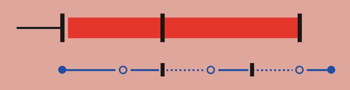
Privacy manipulation makes invasive data choices easier than protective ones. It may use a prominent “Accept all” control, fragmented refusal steps, vague purposes, repeated prompts, or warnings that exaggerate what will break. Ask for data in context, explain the specific use, and make the protective choice understandable and reachable. Consent should be granular where the purposes differ and revocable through an ordinary setting. A person should not need more persistence or expertise to share less information than to share everything.
Infinite scroll and autoplay
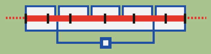
Infinite scroll and autoplay are not inherently deceptive. They can reduce repeated navigation and support continuous media when that behavior matches the task. They become concerning when the design removes natural stopping points, starts the next item without a clear choice, hides pause controls, loses position, or makes disengagement deliberately difficult. Preserve control through visible pause and stop actions, stable history, position recovery, and settings that remain respected. Design continuation as an available convenience, not as a trap that depends on people failing to interrupt it.
Offer a finite alternative when practical, such as pagination, a queue, or an explicit “load more” action. Autoplay should respect platform preferences and should not silently resume later after the person has paused it.
Further reading
Complex and professional products
Preserve useful complexity
Complex products should not pursue superficial sparseness at the expense of power, visibility, or precision. Professional work often contains real structure, dependencies, exceptions, and repeated operations. Hiding those relationships may make the first screen quieter while making the work slower or less trustworthy. The goal is to place complexity where people can understand and control it. The Cognitive Dimensions of Notations offer a vocabulary for examining how a representation supports change, comparison, experimentation, and evaluation without assuming that fewer visible controls always produce a better tool.
Viscosity
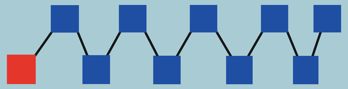
Viscosity is the effort required to make a change. A small conceptual edit may require updates across many screens, records, or formulas, or it may require repeating the same mechanical step for every selected object. Reduce viscosity with batch operations, linked changes, reusable styles, templates, and automation where the relationship is reliable. Do not remove useful friction from changes that need deliberate review. Evaluate the distance between the size of the intended change and the amount of interface work needed to express it accurately.
Hidden dependencies
Hidden dependencies make it difficult to see what else a change will affect. A renamed field may break a report, an adjusted schedule may move downstream work, or a deleted asset may still be referenced elsewhere. Expose relationships near the object and before commitment. Show affected items, incoming and outgoing links, scope, and conflicts in a form people can inspect. When the full dependency graph is too large, summarize the consequence and provide a route into detail. Recovery history helps, but it does not replace knowing the likely impact in advance.
Premature commitment

Premature commitment requires a decision before the person has enough information to make it well. A setup flow may demand a permanent structure before real content exists, or a professional tool may require exact parameters before exploration reveals the useful range. Delay decisions that do not yet matter, provide provisional values, and let people revise earlier choices without rebuilding later work. When an early commitment is technically necessary, explain its downstream effect and offer comparison, preview, import, or a reversible trial before it becomes difficult to change.
Visibility
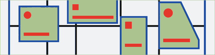
Visibility is the ability to view and compare the parts of the system that matter to the current decision. A clean screen can have poor visibility when it hides status, parameters, related objects, or the result of a change behind repeated navigation. Keep relevant values together, support comparison across versions or items, and preserve context when opening detail. Visibility does not require showing everything at once. It requires a dependable route to the information needed for judgment without forcing people to remember it across screens.
Role-expressiveness

Role-expressiveness is the ability to tell what each element does within the work. A control, symbol, column, or region should reveal its purpose through labeling, placement, form, and relationship to the result. Repeated but visually identical elements can still play different roles, so local context matters. Use domain terms people recognize and expose the effect of less familiar operations before commitment. When expertise is expected, compact notation can be appropriate, but the notation should remain consistent enough that learned meaning transfers throughout the product.
Hard mental operations
Hard mental operations are calculations, transformations, comparisons, or memory tasks the interface leaves for the user to perform internally. People may have to convert units, reconcile dates, remember values from another screen, or imagine how several settings combine. Show computed results, place comparable values together, preserve references, and preview the consequence of interacting parameters. Do not automate away professional judgment that depends on context. Support it by making the inputs and relationships inspectable so expertise is spent on the decision rather than on clerical reconstruction.
Provisionality

Provisionality is the ability to leave work incomplete, uncertain, or experimental without pretending it is final. Drafts, branches, temporary values, annotations, and reversible trials let people explore before commitment. A system with low provisionality forces every entry to satisfy final rules too early or exposes unfinished work as if it were approved. Make provisional state visible, preserve it safely, and define how it becomes shared or final. Professional work often develops through partial understanding, so the interface should support refinement without confusing a possibility with a decision.
Progressive evaluation

Progressive evaluation is the ability to assess work before it is complete. Live previews, validation, simulation, intermediate results, and comparison against requirements help people correct direction while changes are still inexpensive. Feedback should reflect the current state honestly and distinguish incomplete input from a true error. Let people inspect both local effects and wider consequences where those differ. Waiting until export, publication, or execution to reveal the result turns learning into rework. The product should make evaluation available at the points where it can still influence the outcome.
Closeness of mapping

Closeness of mapping describes how directly the representation corresponds to the thing being controlled. Moving an object on a canvas has a close spatial mapping; editing coordinates in a table is less direct but may be more precise. Neither method is universally better. Pair direct manipulation with exact entry when the work needs both intuition and control. Use units, terminology, grouping, and direction that match the domain. A close mapping reduces translation effort, while an alternate representation can expose structure that the literal view makes hard to compare.
Paths for novices and experts
Novices need visible basic actions, recognizable terms, safe defaults, examples, and enough feedback to form an accurate model. Experts need speed, density, precision, and ways to repeat or transform work at scale. Supporting one group should not permanently slow the other.
Build layered paths to the same underlying capabilities. Keep ordinary actions visible, then add shortcuts, command palettes, batch operations, templates, presets, automation, customizable tools, and advanced panels for repeated work. Pair direct manipulation with precise entry. Preserve consistent names and results across routes so learning transfers. Progressive disclosure should delay detail until it becomes relevant, not hide power so thoroughly that people cannot discover or trust it.
Let preferences and learned shortcuts persist. Expertise should reduce repeated effort without creating a separate product whose state and outcomes no longer match the visible path.
Further reading
Diagnostic catalogs
Consolidated UX anti-patterns
Understanding and discoverability
- Tappable content with no signifier
- Static content styled like a control
- Unlabeled unfamiliar icons
- Required gesture with no visible alternative
- Disabled control with no explanation
- Mismatch between appearance and behavior
- Mixed navigation semantics
- Ambiguous scope
- Internal system language exposed to users
- Category-value confusion
Perception and hierarchy
- Equal spacing between unrelated and related items
- Card treatment applied to everything
- Multiple competing primary actions
- Color as the only state indicator
- Modal and background with equal weight
- Weak selected or focused states
- Constant animation or badges
- Visual prominence assigned to promotion instead of the task
Memory and attention
- Comparison from memory
- State disappearing when a panel closes
- Hidden active filters
- Lost selection
- Repeated entry
- Feedback far from the initiating action
- Distant values changing without notice
- Content moving beneath the user’s finger
- Permanent warnings that become invisible
- Lost context after interruption
Choice and decision-making
- Vague options with indistinguishable differences
- Recommendations without rationale
- Consequential preselection
- Forced early commitment
- Surprise requirements late in a flow
- Optional work presented as incomplete
- Artificial progress
- Cost or privacy explained after commitment
Navigation and sense of place
- Back returning to the root
- Search or filters reset after opening a result
- Scroll position lost
- Tab changing behavior by context
- Destination labels with weak information scent
- Deep links opening without relevant context
- Modal stacked on modal
- Full-screen replacement with no spatial continuity
- Search scope changing silently
Touch and mobile ergonomics
- Small or crowded targets
- Destructive and safe actions adjacent
- Invisible or overlapping hit regions
- Dragging as the only method
- Precise slider for a precise value
- Controls moving during interaction
- No pressed state
- Duplicate activation
- Required long press with no cue
- Keyboard covering the field or submit action
Feedback and system state
- No acknowledgement of input
- Endless unnamed spinner
- Success shown before confirmation
- Loading, empty, and error states appearing identical
- Offline edits silently discarded
- Stale content with no freshness indication
- Sync conflict silently overwriting work
- Recovery available only in a toast
- Progress lost after interruption
- Partial failure reported as total failure
Forms
- Placeholder used as label
- Underspecified field labels
- Wrong keyboard type
- Autofill or paste blocked
- Validation while an answer is still being formed
- Error only at the top of a long form
- Values cleared after failure
- Format rules disclosed after submission
- Requirements not identified
- Disabled Submit with no visible reason
- Re-entry of known information
- Generic “Invalid” error
Errors and recovery
- Routine confirmation dialogs
- “Are you sure?” without consequence or scope
- Permanent deletion without adequate feedforward
- No undo for frequent reversible actions
- Generic errors for distinct failure conditions
- Successful batch work discarded after one failure
- Invisible mode changes
- Error messages blaming the user
- Recovery that restarts the entire flow
Accessibility
- Fixed text sizes or row heights
- Missing accessible labels and roles
- Incorrect selected or expanded state
- Illogical focus order
- Focus remaining behind a modal
- Dynamic changes not announced
- Motion ignoring user preference
- Required drag or multipoint gesture
- Audio without captions or transcript
- Haptic-only status
- Unnecessary orientation lock
Trust and ethics
- Price revealed late
- Trial renewal obscured
- Cancellation deliberately difficult
- Consent preselected
- Rejection hidden or judgmental
- Repeated prompts after rejection
- Fake scarcity or social proof
- Ads disguised as content
- Public sharing as an unexplained default
- Data export made impractical
Practical UX audit
Goal
- Is the likely user goal clear?
- Does the interface support it before promoting a business goal?
- Is the primary action visible and accurately labeled?
Understanding
- Can users identify what is interactive?
- Do appearance and behavior agree?
- Is action scope clear?
- Does terminology match the user’s domain?
Structure
- Does spacing communicate relationships?
- Do groups reflect meaningful concepts?
- Is current location visible?
- Do labels provide strong information scent?
Cognitive effort
- Must users remember something the interface could show?
- Are comparison and selected state visible?
- Does the system preserve previous values and context?
Choice
- Are differences understandable?
- Are defaults safe and honest?
- Can unnecessary decisions be deferred?
- Are cost, privacy, and commitment visible before action?
Interaction
- Are targets comfortably large and separated?
- Do gestures have alternatives?
- Is duplicate activation protected?
- Does the interface work with the keyboard visible?
Feedback and recovery
- Is input acknowledged immediately?
- Can users distinguish pending, confirmed, failed, stale, and offline states?
- Is feedback near the relevant action?
- Is undo available for routine reversible actions?
- Is entered work preserved?
- Are partial failures reported accurately?
Accessibility
- Does the interface work with larger text?
- Is meaning available without color, sound, haptics, or motion alone?
- Are semantic names, roles, values, and states correct?
- Are gesture alternatives available?
Trust
- Are total cost and renewal clear?
- Are permissions requested in context?
- Is rejection as practical as acceptance?
- Is cancellation straightforward?
- Does the product preserve autonomy?
Principles cross-reference
The named principles covered throughout the guide are indexed here:
- Aesthetic-Usability Effect — Perception and visual organization
- Choice Overload — Choice, judgment, motivation, and autonomy
- Chunking — Memory, attention, habits, and cognitive load
- Cognitive Bias — Choice, judgment, motivation, and autonomy
- Cognitive Load — Memory, attention, habits, and cognitive load
- Doherty Threshold — Feedback, system state, time, and sensory delight
- Fitts’s Law — Touch, movement, and mobile ergonomics
- Flow — Choice, judgment, motivation, and autonomy
- Goal-Gradient Effect — Choice, judgment, motivation, and autonomy
- Hick’s Law — Choice, judgment, motivation, and autonomy
- Jakob’s Law — How people understand interfaces
- Law of Common Region — Perception, grouping, and visual organization
- Law of Proximity — Perception, grouping, and visual organization
- Law of Prägnanz — Perception, grouping, and visual organization
- Law of Similarity — Perception, grouping, and visual organization
- Law of Uniform Connectedness — Perception, grouping, and visual organization
- Mental Model — How people understand interfaces
- Miller’s Law — Memory, attention, habits, and cognitive load
- Occam’s Razor — Complexity and prioritization
- Paradox of the Active User — Progressive complexity and learnability
- Pareto Principle — Complexity and prioritization
- Parkinson’s Law — Complexity and prioritization
- Peak-End Rule — Choice, judgment, motivation, and autonomy
- Postel’s Law — Complexity and prioritization
- Selective Attention — Memory, attention, habits, and cognitive load
- Serial Position Effect — Memory, attention, habits, and cognitive load
- Tesler’s Law — Complexity and prioritization
- Von Restorff Effect — Perception, grouping, and visual organization
- Working Memory — Memory, attention, habits, and cognitive load
- Zeigarnik Effect — Memory, attention, habits, and cognitive load
The unifying principle is:
A good interface makes goals, actions, consequences, state, structure, and recovery understandable without demanding unnecessary memory, precision, patience, or trust.